7 Website Mistakes That Quietly Cost Small Businesses Customers
Is your website turning visitors away? Seven common mistakes that cost small businesses leads and sales, and practical fixes for each.
Most websites don't fail loudly. There's no error message, no angry email, no alert. Visitors simply arrive, look around for a few seconds, and leave for a competitor. You never find out who they were or what they would have bought.
The good news is that the reasons are usually predictable, and most are fixable without rebuilding your site from scratch. Here are seven of the most common mistakes on small and growing business websites, and what to do about each one.
1. Visitors can't tell what you do in a few seconds
People make up their minds about a web page fast. Usability research summarised by Nielsen Norman Group found that users often leave web pages within 10 to 20 seconds, and that to hold attention you need to communicate your value proposition within the first 10 seconds.
Yet many homepages open with a vague slogan ("Excellence in every detail"), a rotating slider, or a wall of company history.
The fix: make the top of your homepage answer three questions in plain language:
- What do you offer? ("Commercial cleaning for offices and clinics")
- Who is it for, and where? (your customers and service area)
- What should I do next? (one clear button, such as "Get a free quote")
2. There's no clear next step
A visitor who is interested still needs to be told what to do. If your phone number is buried in the footer, your contact page is three clicks deep, or every page ends with nothing at all, you're relying on visitors to do the work. Many won't.
The fix:
- Choose one primary action for the site (call, book, request a quote, buy) and make it visible on every page.
- Put your contact details where people expect them: the top of the page and the footer.
- On mobile, make phone numbers and email addresses tappable.
3. Forms and checkouts ask for too much
Every extra field, step or forced sign-up is a reason to give up. Baymard Institute's research on online checkouts found that 17% of US online shoppers have abandoned an order because of a "too long / complicated checkout process", and that being made to create an account is another common reason people abandon. Baymard's testing also suggests an ideal checkout can get by with as few as 7 to 8 form fields.
The same applies to enquiry forms: ask for budget, job title and company size up front, and you'll lose people who were ready to talk.
The fix:
- Cut every field you don't genuinely need at this stage. Name, contact details and a message are often enough.
- Offer guest checkout if you sell online.
- Show total costs, including delivery and taxes, as early as possible.
4. There's nothing to make a stranger trust you
A first-time visitor has no reason to believe you're reliable, so your website has to show it. Trust matters most when money changes hands: in the same Baymard research, "I didn't trust the site with my credit card information" was one of the most common avoidable reasons shoppers gave for abandoning a purchase.
The fix: add clear, honest proof that you're a real, established business:
- Genuine reviews and testimonials, ideally linked to a public source such as your Google reviews.
- Real photos of your team, premises and work, rather than generic stock images.
- Clear policies: pricing (or at least a starting price), delivery, returns, cancellations and privacy.
- A full "About" page and visible contact details, including a physical address if you have one.
5. Browsers are warning people away
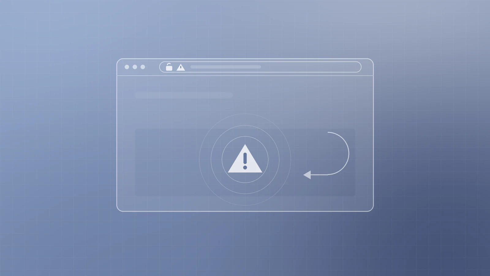
If your site still runs on plain HTTP rather than HTTPS, visitors may see a "Not secure" label next to your address. Google Chrome has marked all HTTP pages as "not secure" since 2018, and the warning is more prominent on pages where users enter information, which is exactly where your contact and checkout forms live.
The fix: install an SSL/TLS certificate (many hosts include one free), redirect every HTTP address to its HTTPS version, and check that no images or scripts are still loading over HTTP. Keep your CMS, themes and plugins updated too; a hacked site costs far more than lost leads.
6. The site looks neglected

Small signs of neglect add up: a copyright notice that's years out of date, a "Latest news" section whose newest post is from long ago, old prices, broken links, staff who left ages ago, or a contact form that quietly stopped sending emails. Each one makes visitors wonder whether you're still in business, or still paying attention.
The fix:
- Set a quarterly website check: click every main link, submit every form, and confirm the messages arrive.
- Remove or update outdated pages instead of leaving them live.
- If you can't keep a blog or news section current, it's better to hide it than to show stale content.
7. You're not measuring anything
If you don't know how many people visit, where they come from and what they do, every decision about your website is a guess.
The fix:
- Set up a free analytics tool such as Google Analytics and confirm it's actually recording data.
- Track the actions that matter to your business: form submissions, calls, bookings and purchases, not just page views.
- Review the numbers monthly. Look for pages with plenty of visitors but few enquiries. Those are your best opportunities.
A quick self-check
Open your website on your phone and ask yourself honestly:
- Can a stranger tell what I do within a few seconds?
- Is the next step obvious on every page?
- Are my forms as short as they could be?
- Would I trust this business with my money?
- Does the browser show the site as secure?
- Is everything on the site current and working?
- Do I know how many enquiries the site produced last month?
Any "no" is a leak worth fixing, and fixing it is often quicker and cheaper than paying to bring in more traffic.
Want a fresh pair of eyes on your website?
It's hard to judge your own website objectively. You know where everything is, so you don't notice what's missing. If you'd like an outside view, the team at Inferas can review your site for clarity, trust, usability, security and tracking, and give you a practical, prioritised list of improvements.
Get in touch with us at inferas.in. No pressure, just an honest look at what's helping your website and what's holding it back.